Category: Pro Photography Insights
This is purely to share the many interesting articles that we come by online. The intent is to share information. We may not own the copyright of all articles shares as the intent information sharing ! Enjoy !
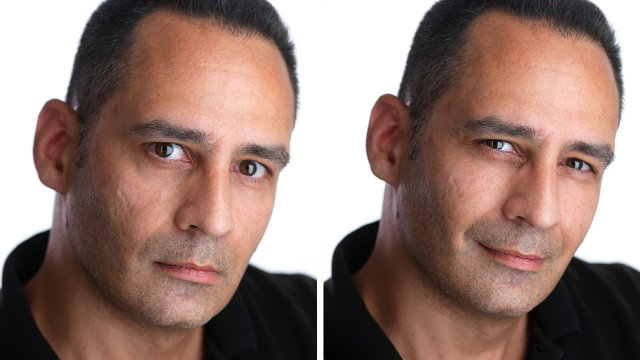
Saturation:over-Saturation:Vibrance – a virtual discussion
This is a conversation started by Sugandha Dubey on FB. Saturation versus over-saturation of digital photographs.
Sugandha Dubey I see a lot of images everyday. I speak to few photographers too. I have a question that I would like to put up here.
I hope I get some interesting answers to my very basic ” duh sounding” query.
Why do you like to over-saturate your images ?
Udit Kulshrestha Sugandha : Compare an image shot on velvia film and digitally saturated. Velvia will still appear with more saturation…
Ankit Narang Mam as in this digital age there are lots of amateur photographers and they don’t actually know, that to what extent the saturation should be pumped up so that the colors wont bleed out . Plus as majority of these photographers use non calibrated monitors . It looks fine on their screen but actually it is over saturated.
Monica Dawar I guess photographers do it bcoz they believe for the purpose of printing photograph is processed normally but for the purpose of online exhibit over-saturation is required!
Justin Rabindra Good question. I tended to do that (loved the artificially richer colours), though now I’ve started to control myself (I think.)
Saptorshi Majumdar overcompensating for the bleak reality around.
Sugandha Dubey Interesting feedback so far… if this goes well I may carry a post on our blog with credits to each one of u
Sanjay Nanda 1 images shot in raw are usually flat, so saturation needs to be bumped up to normal levels. 2 images shot in jpg are automatically saturated by the camera processor. 3 most amateur photographers usually over boost the saturation for a more impactful image. 4 all new flatscreen monitors are backlit and come callibrated at 9600K, so diaplay images more brightly than normal, making the image look saturated.
Himanshu Sharma I understand where this question comes from. I myself see a lot of oversaturation done on a lot of amateurish images. I myself shoot a lot in Raw format. Raw images are flat, and it depends solely on the editor to turn it into something he/she desires. Saturation is something which attracts the eye ( well to some ), but to an extent. what might look as saturation, might as well be lowered highlights, or darker shadows, or just lowered luminance of the colors. A lot of parameters go into editing these images. Its all in the perspective. Do i, as a photographer want people to see what they already see through naked eyes, or do i want to portray what might be more dreamy, more appealing. HDR photography is another example. Some people love it, a lot dont. It feels so unreal, yet so desirable at times. One perfect example of playing with saturation can be of ashot i clicked few days ago. it was of a sunset/ twilight period. Through naked eyes i could not see magenta/purple colors in the clouds. But saturating those colors itself i was amazed with the results. They infact were present in the raw image, right around the extreme edges of the cloud formation. I might have been random in my thoughts here, but i feel its solely on the perspective. Over saturation in most images is an overkill, but it might bring wonders to an image in certain scenarios.
Udit Kulshrestha Front lit images are contrasty and saturated more than the rest. Principles of light say so.
Himanshu Sharma Another rookie mistake most of us make, is to saturate the entire image, than to saturate the colors independently which need it.
Ravi Dhingra If we are talking of digital art and not photography in its pure form, oversaturation may work.
Md Ahasan oversaturation works…
Akshat Jain Good question Sugandha
A quick tip for fellow photographers: Try to increase the ‘Vibrance’ instead of Saturation in PS or Lightroom.
Sugandha Dubey Thank you Gentlemen. It is a pleasure reading the replies. I am sure there are others too who read it
Can I also request Aditya Arya Dinesh Khanna and Ashish Chawla , Samar S Jodha to give their perspective as well ? Would be nice. Also if we have any body from print experience background in this group may be they would like to shed some light how over saturation impacts printing quality ?
Akshat Jain If one is using a colour managed system, there is almost no difference in what you see on screen and in print.
Another tip: While saving photographs to be uploaded on web, use Save for Web & Devices (Alt + Shift + Ctrl + S) in PS, tick convert to sRGB, embed colour profile, optimized and change the quality and image size as required.
Dinesh Khanna I think most of the points one would make have already been made here. The problem, if one can call it that, lies in the amount, and more importantly, the ease of control available to the photographer to work on the image after its been shot. Saturation and sharpening are the 2 things people tend to overdo while using the sliders.
Sanjay Nanda dont agree with akshat. a CMS does help, but an image displayed on screen does not necessarily have to match the image on print, especially over-saturated colours. it is always the saturated colours that are out of gamut for most output devices. most pros process images in aRGB, the gamut of a high end image printer is even smaller than sRGB and the CMYK gamut is way smaller. also most people cannot view the saturated colours on their browsers accurately, the limitation being the gamut of the monitor, OS, browser and website. so all details in the saturated colours is lost and the saturated areas look flat.
Udit Kulshrestha Akshat : vibrance increase leads to loss of detail in the saturated colours.
Dinesh Khanna I am so glad I dont know a lot of the stuff some of the people are talking about here . . .
Samar S Jodha Dont know what to say here, As Dinesh Khanna said most has been spoken out here. I am still a sucker for my 4×5 film..or the iphone.
Dinesh Khanna Samar even I shoot incessantly with my iPhone. Almost everything I post on fb is with the phone camera and I love the spontaneity and immediacy it allows.
And I find that I use my dslr only for assignments and long term projects like Mothers & Daughters’ and Benaras.
The 4×5, unfortunately, is now just a much loved but distant dream.
Jasminder Oberoi Masters have already spoken about it in detail. As per my limited understanding, first they over saturate may be because they like it that way; second reason could be since they have that liking of colors, they do not know where to draw the line. I being a sucker for colors, never knew where to stop and almost always went overboard myself. The monitor calibration also adds to their woes. Some have shunned Vibrance as a bad option but to the best my understanding Vibrance is a better choice for fashion oriented images and saturation (using selective colors and layers) is a better option for almost all other kinds of images.
Akshat Jain You mentioned that Increasing “Vibrance” is better. Udit Kulshrestha You said it is not. Now we need a tie breaker ?? Anyone ?
Himanshu Sharma Vibrance often affects only colors which might appear milder and most of the time does not affect colors which are already saturated to a point. Saturation on the other hand, increases the color intensity irrespective of what they already are.
i prefer vibrance over saturation any day.
Sanjay Nanda vibrancy is just like saturation, but only a selective saturation booster. it effects only non-saturated colours but has no effect on skin tones. btw vibrance is an apple aperture option, not LR or PS.
Himanshu Sharma It sure is an option in Lightroom. have been using it for an year now.
Sanjay Nanda Oh, sorry. Mixed up with some other adjustment option.
Jasminder Oberoi Saturation bumps all the colors uniformally which means that if a color in an image is already little more saturated than others, it has high chance of looking bad (bleeding might also occur). Where as Vibrance just works on weaker colors leaving the already strong colors alone. It also does not make skin look un natural. IMO its a better option..
Sugandha Dubey IMO = ?@ Jasminder Oberoi, Sanjay NandaVibrance is in PS too ver. 6
Himanshu Sharma * in my opinion
Sugandha Dubey LOL now this one foxed me too I was wondering what is this new control IMO
Himanshu Sharma haha.. a distant cousin of ISO
Jasminder Oberoi lol.. yes its in photoshop as well..
This brings it to the end of the such an informative and interesting conversation on the page of Delhi Photographers on FB. Thank you Monica and all the gentlemen who engaged. This is shared by www.stockimagebank.com to benefit people from advertising, art, students, photographers, professionals … anyone at large who will gain. If you have more perspective on the same please feel free to add here.
We also found a few more interesting links that may be useful and recommend to read.
http://www.photo-mark.com/notes/2009/jan/19/analyzing-photoshop-vibrance-and-saturation/
http://digital-photography-school.com/vibrance-vs-saturation-in-plain-english
Five Tips for Shooting Stock Images
OK, so you have been involved in nature photography seriously for the last few years, and you have started to accumulate a number of quality images. Maybe it is time to seek an agency, or perhaps you would rather self-market your images. In either case, the leap to “stock images” represents a paradigm shift that will require you to totally rethink your approach to photography. Rather than debate the advantages and disadvantages of various types of agencies, this article covers five specific tips for photographers that market their images or are contemplating doing so.
 Don’t always shoot for yourself- diversify.
It is no longer just about you and what you enjoy shooting. If your intent is to sell images, and you specialize in butterflies or birds only, your market will be restricted to that customer base alone. Expanding your horizon photographically will not only increase sales potential, but it will make you a better, more diverse photographer as well. Embrace each photographic event as an opportunity to expand your portfolio. I once went to SE Oklahoma for a weekend photographing birds. On the way back, a radio communications tower caught my eye, so I stopped and took a few shots. None of the bird images I got that weekend have sold, but the image of the radio tower has sold more than once. There is nothing unique or special about the image; it just happened to catch the editor’s eye on a given day. Not every image you take has to be a nature image.- Vary composition and technique.
Editors and publishers are a finicky lot. I learned long ago that it is pointless to try and second guess them. It is better to offer them choices. Let’s say you encounter a butterfly on a nice, clean perch. Make sure your first shot is with him centered and lots of room on all sides – you have no idea how the editor will want to crop the final image. Then, take more shots from different angles, varying lighting conditions, background, and other elements of the image. It is all about choices. Case in point: Note the Red-bellied Woodpecker image. If I posted that image in the avian forum at PM, it would get numerous negative responses such as chopped bird, too much space on the left, etc. But imagine it as a two page spread in a magazine with lead-in text on the left, and you can then see the potential as a stock image. - Maintain technical perfection.
Stock agencies want you to submit massive quantities of images; and indeed your goal should be to have thousands of images on file eventually. But, don’t sacrifice quality for the sake of quantity. Each image you create represents you as a photographer. Submit only images that are technically perfect. Prior to submitting, pull each image file into your image editor and zoom to 100%. Scroll over the image and get rid of all dust spots. If the image won’t hold detail at 100%, do not submit it. Be your own worst critic. The client deserves a high quality image; anything less can damage your reputation. - >
 Think like an editor.
While it may be impossible to anticipate the specific desire of any given editor, publisher or client, there are a few things you can do to get a leg up on the competition. Put yourself in their shoes; try to think as they would. How do you do that? Pay attention trends and to what is being published. If you are marketing to a specific entity, such as a local magazine, look at back issues. Try and get a feel for the type images they like. Clients want to sell their products, period! Look closely at images in magazines, and you will often see images that at first appear somewhat mundane. In these type images 70-80% of the image will be drab or out of focus, and your eye is automatically drawn to the 10% of the image they want you to see – that is their commercial intent. As nature photographers, we strive to keep elements of the hand of man (HOM) out of our images. For stock photography, the EXACT OPPOSITE applies. People like seeing people in images, doing things, interacting with nature. So, spend more time thinking like an editor, rather than a photographer when making your images. - Marketing 101.
Even if you decide to go with an agency, you still must market yourself. Agency sales will represent only a portion of your sales; the rest is up to you. This is the toughest issue for most photographers; they do not know how to go about marketing their own work. First: be organized and prepared. You photograph a Purple Martin today, and three years later a client asks if you have any Purple Martin images. Will you remember? Maybe, maybe not. Keyword your images and employ any one of the commercial databases available to photographers. Perhaps your goal is to get published in your state’s outdoor magazine. I will offer three ways you could go approach the task: 1). Burn 200 of your best images onto CD-ROM and mail it to the editor. The CD will likely be trashed and never viewed, as the editor does not know you personally. 2.) Create a quality Kinko’s type photo album using the same 200 images, and mail that to the editor. Chances are increased slightly, but when and why will they need your particular images? 3.) Write a 1500 word article relevant to subjects the magazine would cover. Personally deliver the article and album to the editor and introduce yourself in a professional manner. You increased your chances tenfold by cutting his workload. He can publish your article and images will little effort on his part – editors are lazy and love for us to do all the work!


Credit : http://www.photomigrations.com/articles/0706100.htm
We acame across this article by Bill Horn. It made perfect sense to share it with our readers. We hope you benefit from this information and it helps you in creating images that will fetch you revenues.
Shared by : http://www.stockimagebank.com
Importance of Professional Stock Photography in designs.

#798-1888923 © http://www.stockimagebank.com
The use of photography in graphic design had its birth way long ago, back in late 1920 decade, when Herbert Bayer, after leaving Bauhaus school, where he was the teacher of “Print and advertising Workshop”, started to study the interconnections between “advertising science” and psychology.
He started then to integrate photos in his work, with montages and screens, in order to give more dynamics and expressiveness to his creations and make of them what he called “an architectural framework“.
Those really were first photo montages of graphic design history.
In our days, with the use of computer graphics the use of pictures in any kind of job is a must.
Recently I’ve read an article in a blog that stated: “it is useless to spend a lot of time in Stock Photography websites to search for the right shot while you possibly have a nice camera and you can do the shot yourself”.
I personally STRONGLY disagree with this point of view.
Unless you are an experienced photographer yourself, I firmly believe that a paid job is not the moment to make experiments and play with the brand reputation of your customer!
An image in a website, in advertising or any other printed composition is never just a “shot”.
It has, in a first instance, the task to grab attention.
It has then to engage, beautify, tell a story, create desire, and all of this it must be done being consistent with the image of the brand.
To make it short “it has to sell”.
Your photography necessarily must be “professional”: if photography misses the mark, your brand message will be diluted, if not damaged!
After you’ve spent so much time brainstorming about a message that compels, it must be supported by compelling imagery.
Notice also that if you need your image for printing, professional quality is necessary to guarantee quality reproduction.
Never think customers won’t notice it: they will, whether consciously or not.
Furthermore, if you use photos with people you NEED to have the Model Release, a legal document signed by subjects portrayed, that grants you the permission to use and publish the photo.
I have read a lot of times on various design groups on Usenet, both about people that got into trouble because they used a picture without legal permission and others that were bragging about suing others because they used one of their shots, so, I always use professional stock photography.
A thing you have to know, however, are the differences between various kind of licenses:
- Royalty Free is the most common and affordable license type, often called just RF. As the name says, you can use the image purchased as many times as you want without paying an additional royalty. They have usually good prices, that may vary according to the company of your choice. The only downside is that these images are not exclusive.
- Rights Managed license (or RM) gives you exclusive (but time-limited) use of a stock image. This means that if you buy this kind of license you are the only one to use the image in the period specified in the contract. Photos can be used only for one project and for a period of time, sometimes even only on specified geographical areas. This is an expensive licence, but it protect you brand from competition using the same image.
- Extended/ Enhanced licenses. Not every company offers this kind of licenses, which extends the use of a previously licensed work. You have thus the permission to increase the printed copies featuring the image, to use it for resale purposes or for other method of distribution. It is advised to carefully read the contract, as uses allowed vary from company to company.
- Subscription. This is pretty new, it is not available everywhere also, but this kind of offer is quickly expanding. You pay a monthly fee, often choosing among different price plans, and you can download a set number of photos of your choice. This is probably the best deal if you have to download images often. As a plus, you usually have no limitation about the use.
Credit : http://www.graphdesign.com/ Shared by http://www.stockimagebank.com
Top 10 Ways To Piss Off A Photographer
Top 10 Ways To Piss Off A Photographer(in no particular order)
1) Try ‘clever’ tricks to save money.Photographers have seen and heard just about every trick in the book, and you should realize this. You can expect to piss off a photographer if you treat them as if they haven’t experienced a few of these money-saving tricks already.
Don’t say that an assignment will take 2 hours when you know it will realistically require a full day of work. Don’t try to expand the assignment into something more when the photographer arrives on the scene, and expect them to bend over backwards to “help you out, just this once.”
You should understand that a photographer is a small business owner, and they’re not trying to use their own clever tricks to jack up their rates. They want a fair, respectable price. Be upfront and totally honest with them from the very beginning, and you’ll find them much more willing to “help you out” in the end.
2) Don’t understand what it’s like in the real world.Most editors spend their working day in an office, dreaming up perfect situations and scenarios where everything goes exactly as planned. Most don’t plan for the unexpected, and are surprised and upset when the pre-visualized images they promised to their bosses don’t actually materialize.
Instead, treat the photographer as a partner. Let them know that what you’re asking for is just something intended to get you both on the same page, and you’re not expecting miracles.
Encourage them to think beyond the box, and deliver something even better. If you put a little faith in them as a partner, you’ll often find they’ll work harder for you to come up with something truly great. Something you can both be proud of.
3) Screw up the schedule.This is usually related to having little idea what it’s like in the real world. Scheduling is very important to a photographer, especially when the photo editor is the person setting up the shooting appointment with the subjects.
Don’t assume, for example, that a photographer in Los Angeles can drive to San Francisco and back within 2 hours. In this case, take the extra step and go to Google Maps and figure out the driving times in advance.
Be as clear with the photographer as possible with regard to the schedule. If you’re unsure about something, or if there may be some waiting time once they arrive on the scene – let them know in advance. You should understand that they may have an assignment booked after yours. Letting them know that the schedule may change without notice will give them an opportunity to plan accordingly, and not screw up another assignment because yours ran late.
4) Expect unlimited use of an image, for free.Don’t be outraged when a photographer sends you an invoice after you’ve used an image again. Don’t assume that every image is Royalty-Free, even if the image was shot on assignment for you.
When a photographer shoots an image, they are hoping to produce something good enough that it will be used in many places – that there will be a demand for the image. If you suspect that you will want to use an image over again, in different places, tell the photographer in advance and work out a deal. Don’t just assume that you can use it, and then “deal with it later” if/when you’re caught.
5) Be difficult to contact.This goes both ways – both photographers and photo editors should be easy to contact. Great communication between the parties means that you’re working as partners, each available to the other as the assignment unfolds.
Everyone knows the importance of this. If you expect people to be easy to contact, you should make yourself easy to contact as well.
6) Ask them to copy the style of another photographer.Most people who become photographers do so because it’s a creative outlet. It allows them the freedom to express their own vision. Not understanding this very basic concept will piss off any photographer who has pride in their work.
Treat a photographer as a person who has their own creative process – and it’s the creative process that you’re paying for.
Don’t treat a photographer like a robot with a camera. Showing them an image, and asking them to replicate it is considered an insult to most. Asking them to “shoot the same thing you did last time” could end up making them second-guess their own creative process.
7) Have a big ego.Let’s face it, both photographers and photo editors can have a bit of an ego. They’re both often sensitive about their work because, if they do their jobs right, they really put themselves into a project and it ends up becoming an intimate personal expression.
When big egos collide, bad things can happen. Treating each other with respect, as an equal partner in the creative process, will yield better results in the end.
Accept that fact that you actually need each other, and no person is more important, or has “more power” than the other.
8) Offer a photo credit as payment.Photographers will be easily pissed off when you offer a photo credit as if it has some kind of monetary value. They will be further pissed off if you insinuate that a photo credit in your highly respectable publication will help their career.
You should understand that it costs a photographer time and money to produce the image that you want to use, and a photo credit can’t be used to pay their bills. Offering a photo credit as a form of payment is an insult.
9) Use images without permission.If you don’t have money to pay for the use of an image, don’t just take the image and use it anyway – and deal with any potential fallout later. Contact the photographer in advance, and see if you can work something out.
Using an image without permission is rude and offensive to most photographers.
10) Crop their photos to the point of obscurity.Photographers often spend a lot of mental energy composing an image, and brutal cropping hack-jobs can easily send a photographer into a pissy mood. This is like cutting the first 2 paragraphs out of a writer’s story, and expecting the writer to be perfectly fine with it.
Contact the photographer ahead of time, let them know the reasons why the image must be cropped this way, and have a discussion about it before its too late. It is insulting to see your image in print with the heart and soul cropped out.
Credit : John Harrington is an editorial, corporate and commercial photographer based in Washington, DC.
———————————————————————————————————————————————-
100 Learnings About Photography
100 Things I Have Learned About Photography.
1. Just because someone has an expensive camera doesn’t mean that they’re a good photographer.
2. Always shoot in RAW. Always.
3. Prime lenses help you learn to be a better photographer.
4. Photo editing is an art in itself
5. The rule of thirds works 99% of the time.
6. Macro photography isn’t for everybody.
7. UV filters work just as well as lens caps.
8. Go outside and shoot photos rather than spending hours a day on photography forums.
9. Capture the beauty in the mundane and you have a winning photograph.
10. Film isn’t better than digital.
11. Digital isn’t better than film.
12. There is no “magic” camera or lens.
13. Better lenses don’t give you better photos.
14. Spend less time looking at other people’s work and more time shooting your own.
15. Don’t take your DSLR to parties.
16. Girls dig photographers.
17. Making your photos b/w doesn’t automatically make them “artsy”
18. People will always discredit your work if you tell them you “photoshop” your images. Rather, tell them that you process them in the “digital darkroom”.
19. You don’t need to take a photo of everything.
20. Have at least 2 backups of all your images. Like they say in war, two is one, one is none.
21. Ditch the neck strap and get a handstrap.
22. Get closer when taking your photos, they often turn out better.
23. Be a part of a scene while taking a photo; not a voyeur.
24. Taking a photo crouched often make your photos look more interesting.
25. Worry less about technical aspects and focus more on compositional aspects of photography.
26. Tape up any logos on your camera with black gaffers tape- it brings a lot less attention to you.
27. Always underexpose by 2/3rds of a stop when shooting in broad daylight.
28. The more photos you take, the better you get.
29. Don’t be afraid to take several photos of the same scene at different exposures, angles, or apertures.
30. Only show your best photos.
31. A point-and-shoot is still a camera.
32. Join an online photography forum.
33. Critique the works of others.
34. Think before you shoot.
35. A good photo shouldn’t require explanation (although background information often adds to an image).
*36. Alcohol and photography do not mix well.
37. Draw inspiration from other photographers but never worship them.
38. Grain is beautiful.
39. Ditch the photo backpack and get a messenger bag. It makes getting your lenses and camera a whole lot easier.
40. Simplicity is key.
41. The definition of photography is: “painting with light.” Use light in your favor.
42. Find your style of photography and stick with it.
43. Having a second monitor is the best thing ever for photo processing.
44. Silver EFEX pro is the best b/w converter.
45. Carry your camera with you everywhere. Everywhere.
46. Never let photography get in the way of enjoying life.
47. Don’t pamper your camera. Use and abuse it.
48. Take straight photos.
49. Shoot with confidence.
50. Photography and juxtaposition are best friends.
51. Print out your photos big. They will make you happy.
52. Give your photos to friends.
53. Give them to strangers.
54. Don’t forget to frame them.
55. Costco prints are cheap and look great.
56. Go out and take photos with (a) friend(s).
57. Join a photo club or start one for yourself.
58. Photos make great presents.
59. Taking photos of strangers is thrilling.
60. Candid>Posed.
61. Natural light is the best light.
62. 35mm (on full frame) is the best “walk-around” focal length.
63. Don’t be afraid to bump up your ISO when necessary.
64. You don’t need to always bring a tripod with you everywhere you go (hell, I don’t even own one).
65. It is always better to underexpose than overexpose.
66. Shooting photos of homeless people in an attempt to be “artsy” is exploitation.
67. You will find the best photo opportunities in the least likely situations.
68. Photos are always more interesting with the human element included.
69. You can’t “photoshop” bad images into good ones.
70. Nowadays everybody is a photographer.
71. You don’t need to fly to Paris to get good photos; the best photo opportunities are in your backyard.
72. People with DSLRS who shoot portraits with their grip pointed downwards look like morons.
73. Cameras as tools, not toys.
74. In terms of composition, photography and painting aren’t much different.
75. Photography isn’t a hobby- it’s a lifestyle.
76. Make photos, not excuses.
77. Be original in your photography. Don’t try to copy the style of others.
78. The best photographs tell stories that begs the viewer for more.
79. Any cameras but black ones draw too much attention.
80. The more gear you carry around with you the less you will enjoy photography.
81. Good self-portraits are harder to take than they seem.
82. Laughter always draws out peoples’ true character in a photograph.
83. Don’t look suspicious when taking photos- blend in with the environment.
84. Landscape photography can become dull after a while.
85. Have fun while taking photos.
86. Never delete any of your photos.
87. Be respectful when taking photos of people or places.
88. When taking candid photos of people in the street, it is easier to use a wide-angle than a telephoto lens.
89. Travel and photography are the perfect pair.
90. Learn how to read a histogram.
91. A noisy photo is better than a blurry one.
92. Don’t be afraid to take photos in the rain.
93. Learn how to enjoy the moment, rather than relentlessly trying to capture the perfect picture of it.
94. Never take photos on an empty stomach.
95. You will discover a lot about yourself through your photography.
96. Never hoard your photographic insight- share it with the world.
97. Never stop taking photos
98. Photography is more than simply taking photos, it is a philosophy of life
99. Capture the decisive moment
100. Write your own list.
Copied from Himmat Singh Sodhi’s FB Wall.
———————————————————————————————————————————————-
shared by www.stockimagebank.com June 2012
